Growth By Design

In collaboration with architect Leesa Mayfield and graphic designer Emily Christiansen, I set out to answer these questions at the 2017 Shenandoah University Business Symposium.  The overarching symposium topic was Your Business Legacy.  

One of the uniting themes between interior design and marketing is that both aim to express the point of view of a business.  Design should be part of every businesses marketing budget. By creating a beautiful and functional environment, you are creating a space with which your audience positively associates, supporting the brand story.

In our break out session, Emily spoke about her use of positioning statements to help develop a marketing strategy for her clients.  This was an eye-opener for me, because it helped to highlight the intentions in design that I have always called 'telling the story'.


Howe Hall Astro Lounge

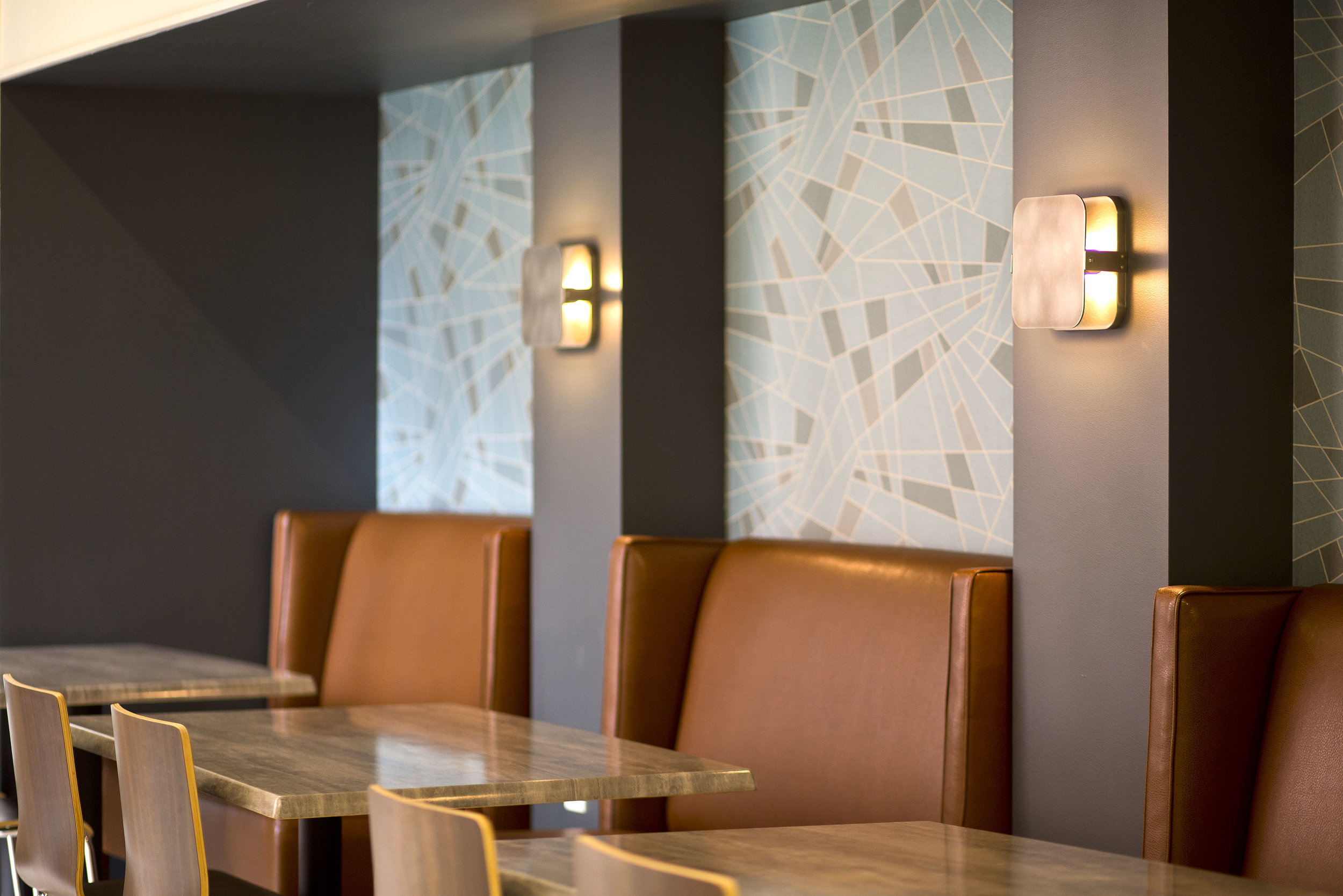
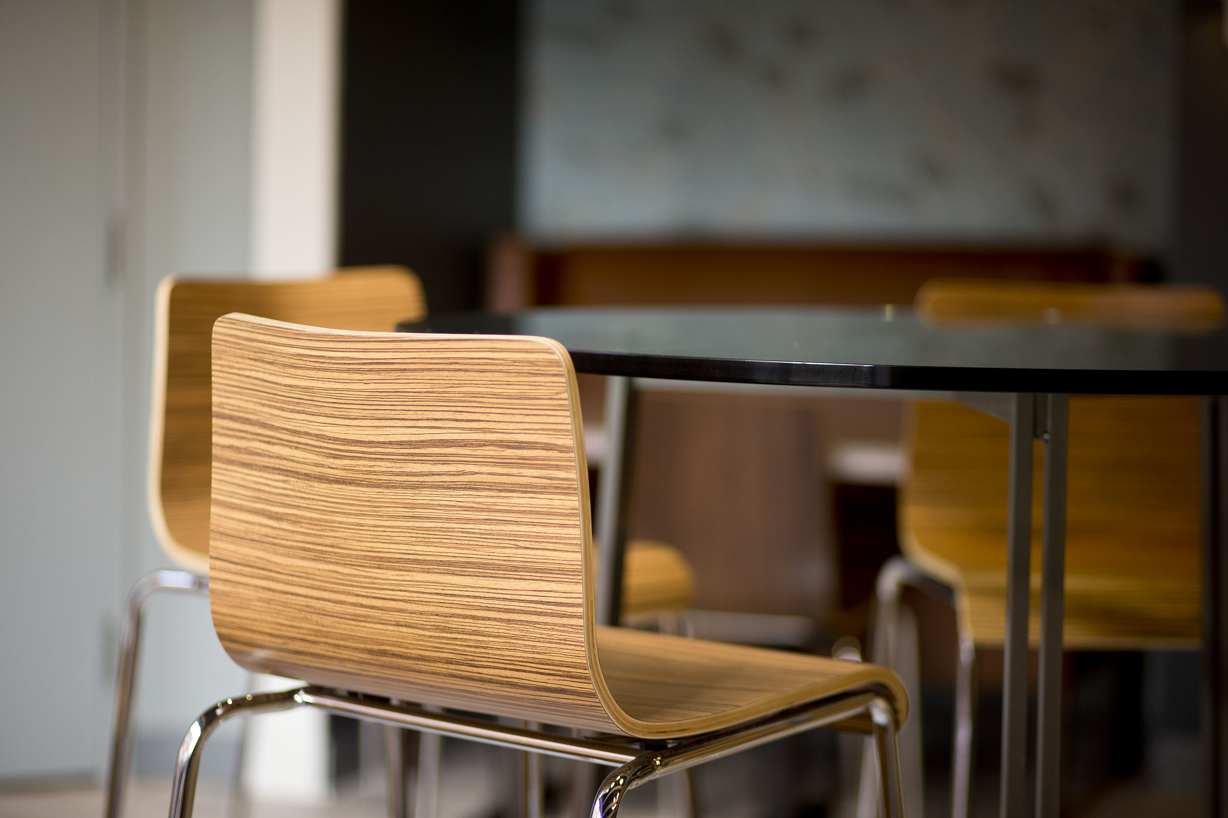
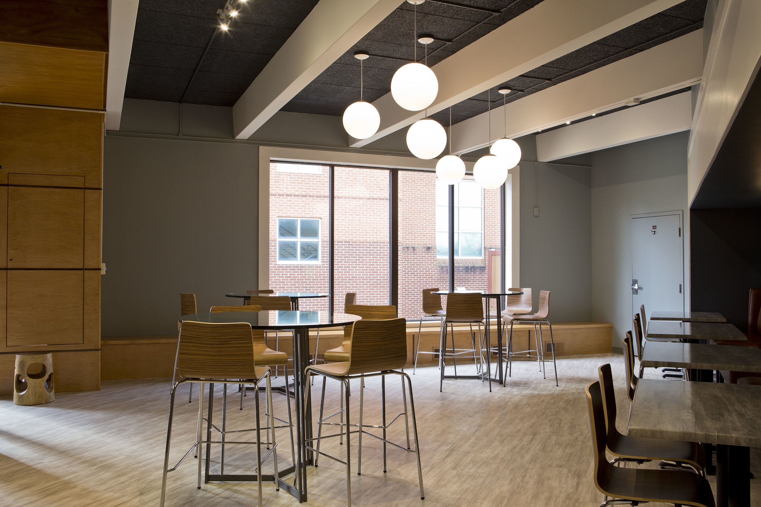
We were approached by Shenandoah University to transform a careworn space into a sleek and inspiring area where students could participate in professional mixer simulations to develop networking skills.  Every square foot of real estate on campus is vital, so the space would also need to function 24/7 as a study area.  From the talk:

 
Great creative opportunities are discovered in making friends with what we cannot change. Within the project scope, we knew that making large spatial alterations was not part of the vision. We would be changing the skin of this space and furnishing it to suit.
 

We wanted to work with the brutalist vintage of the building and play to the popularity of mid-century design.

 
Thinking about things that were fresh and innovative in the 1970s got me thinking about NASA and the space age, which led me to Star Wars. I got to calling this area the Astro Lounge.
 

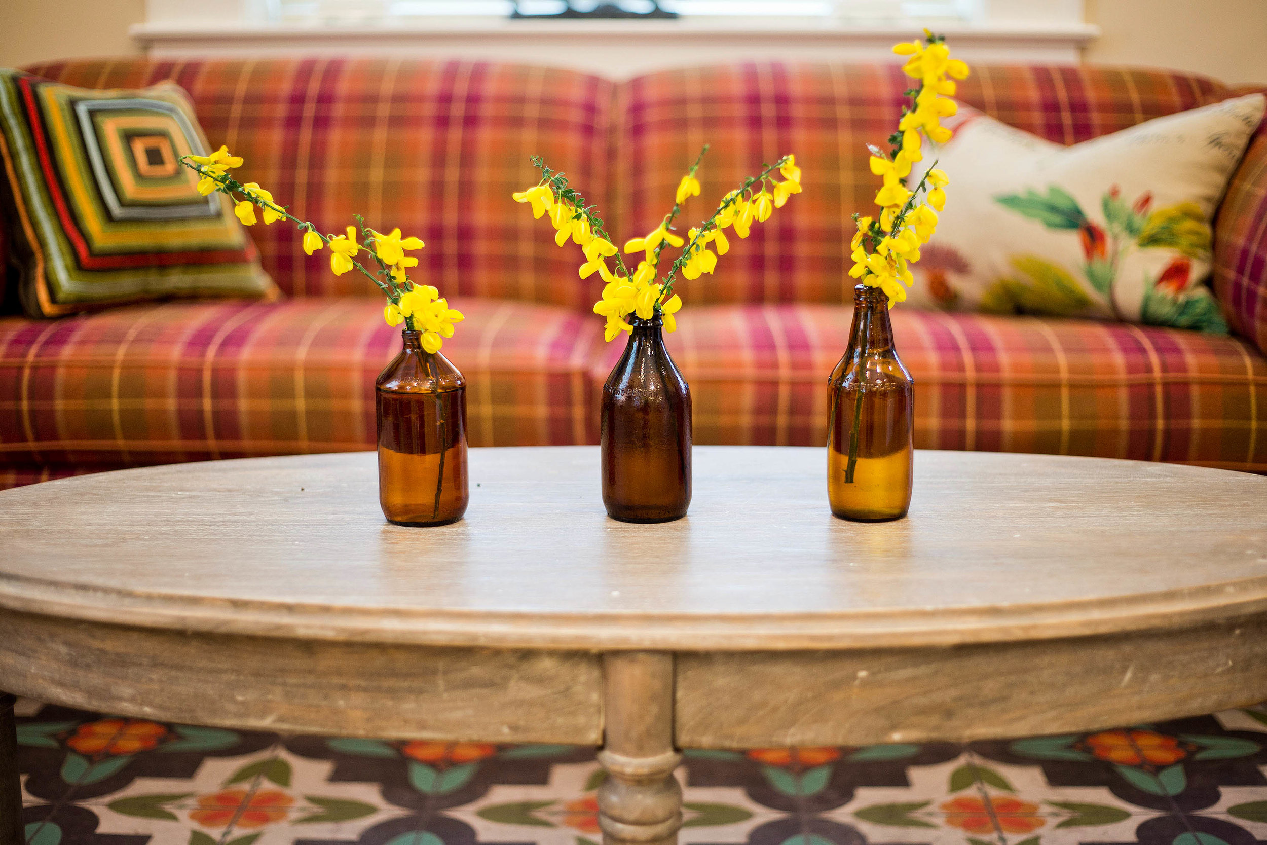
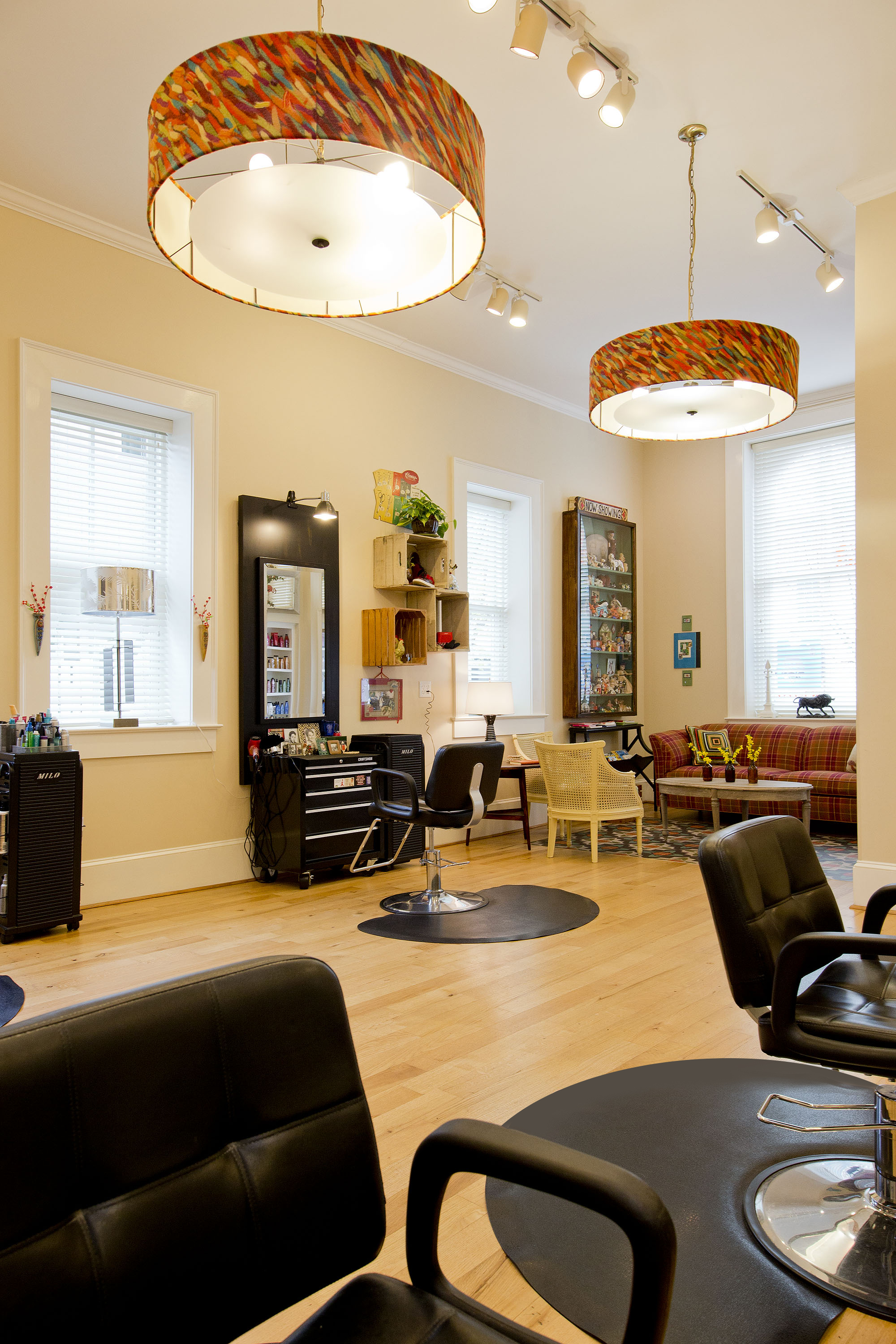
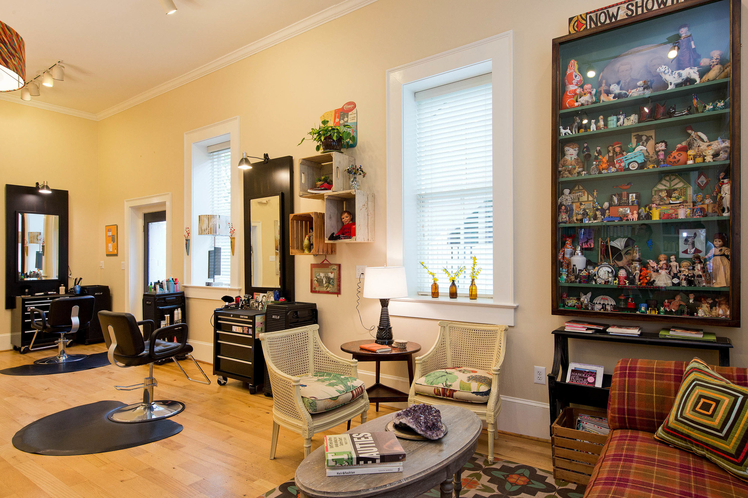
Ed's Heads was a natural fit for the Symposium breakout session.  As a locally-owned boutique business, it provided a contrast in scope from the design for Shenandoah University.  And I could offer more than one perspective on the project.  From the talk:  

 
I am a co-owner and so I thought Ed’s Heads would be a good case study because I know both the inside, business-owner perspective and the outside designer view of the salon.
 

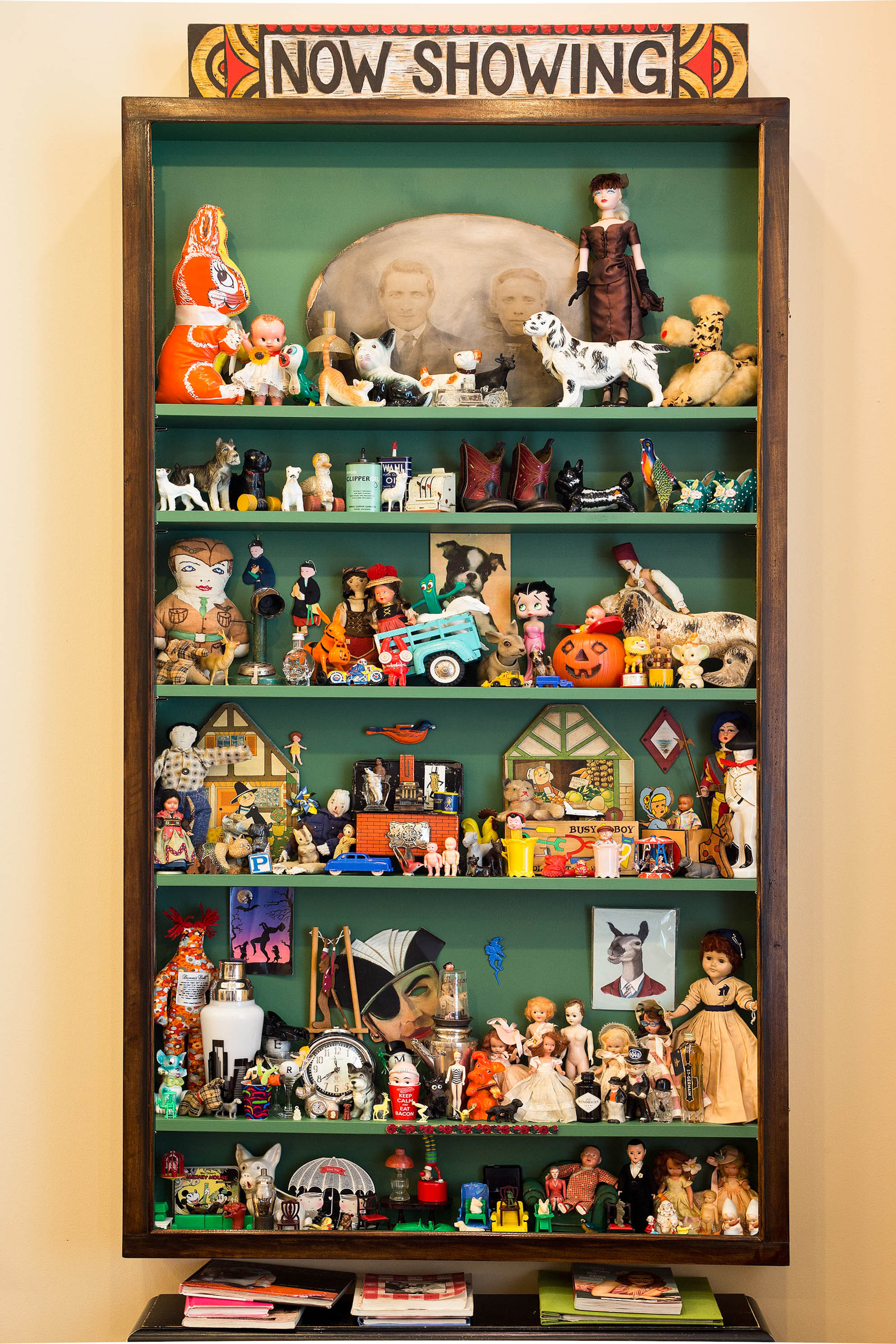
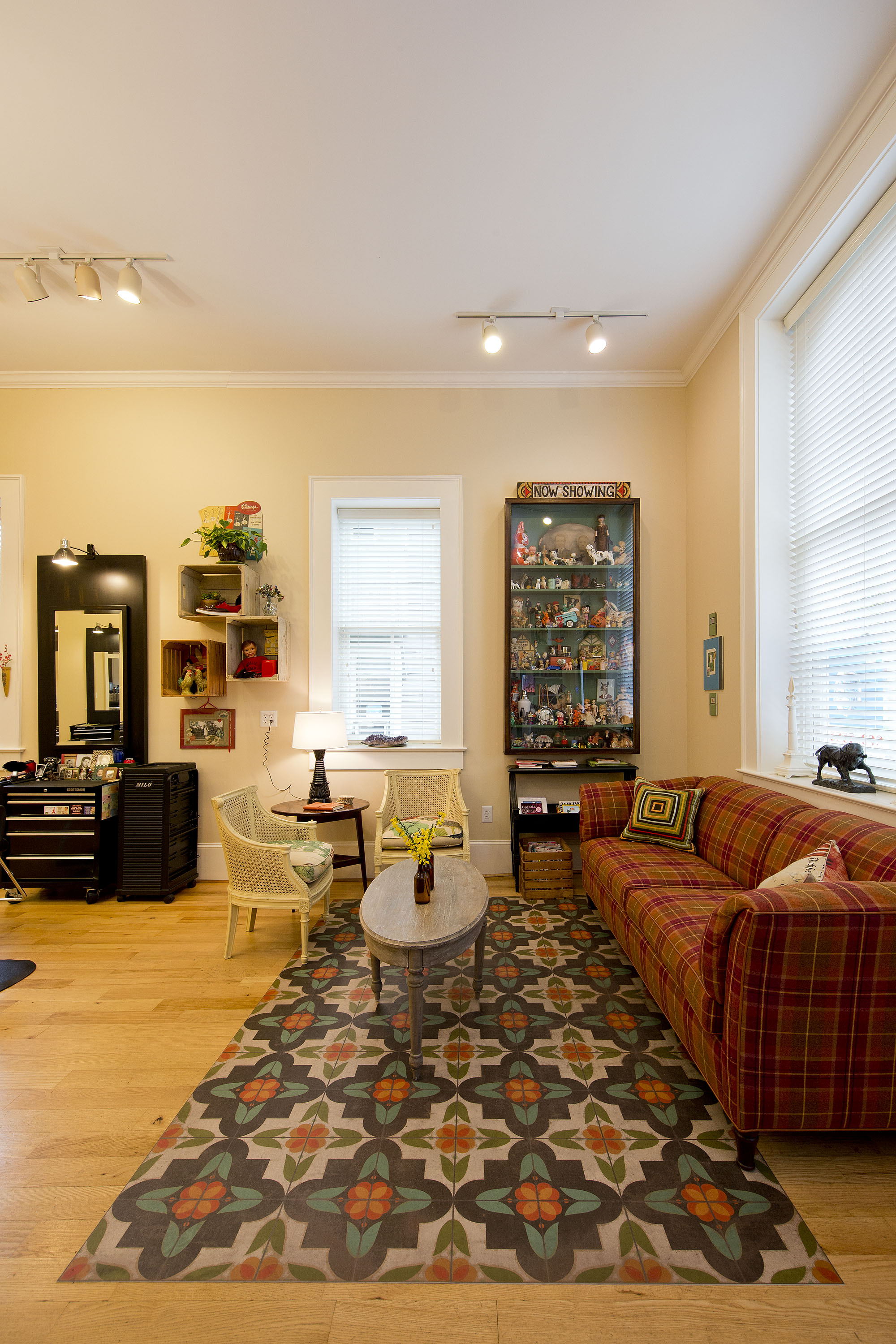
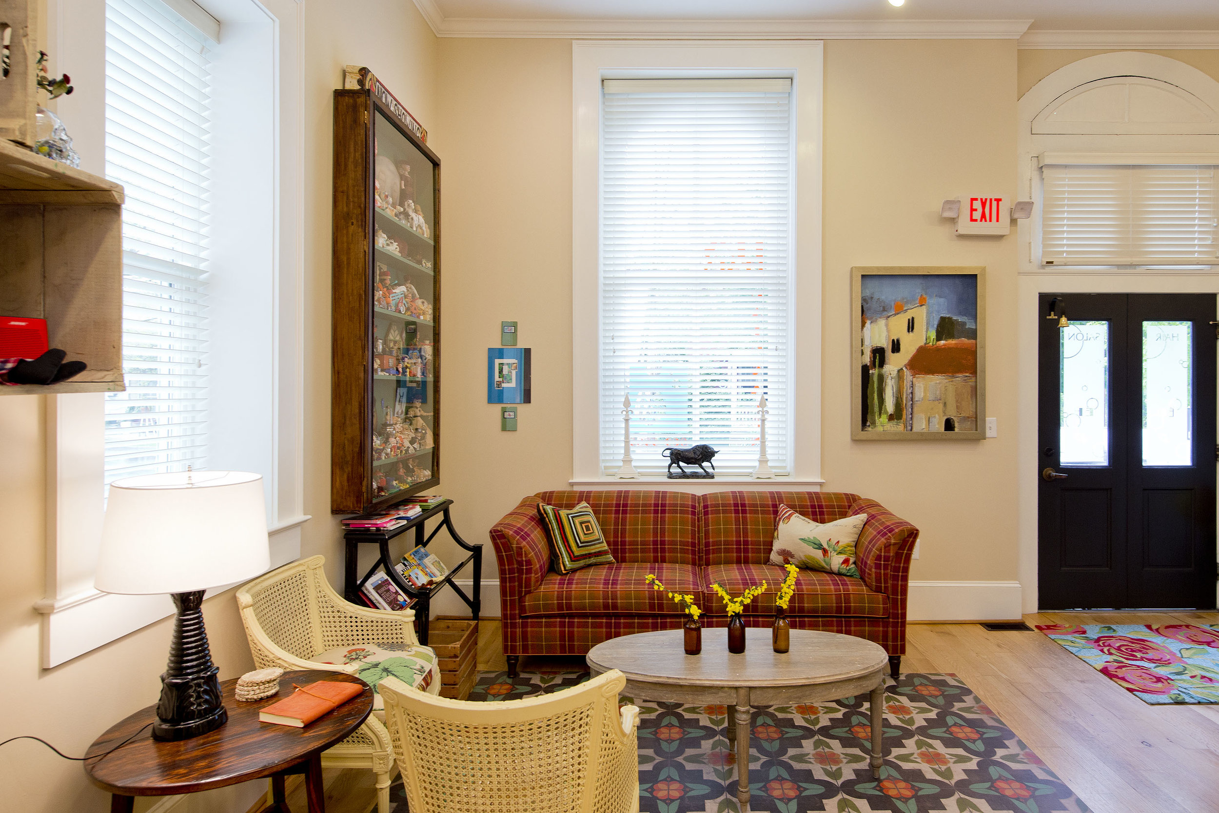
The salon had earned a good reputation as much because of a warm and inviting vibe as it had for providing quality services.  With a gorgeous historic building on Main Street, we wanted to connect to our local roots, while doing so in a way that spoke to the dapper style of the principal owner, my husband, Ed McKee. 

 
After all, why hide from being a small town salon with a close-knit group of stylists when what most of us are starving for is meaningful interactions with real people? One of my mantras was ‘Manhattan meets Mayberry’.
 

The Dark Side of Color Theory

By Paul Miller

Interior Designer, IDS Professional Member


There are many things to consider at the high level conceptual stage of an interior design, but one of the most expressive fundamentals is crafting the color palette.  Here are two palettes from recent projects that, while distinctly different visually, rely on a similar theoretic principle.  Each palette was based on the decision to promote artistic drama rather than the oft over-prescribed notion that spaces should be made to seem larger.

The Garret Room

When we began to noodle the best approach to a family media room in an attic of an historic home, we rejected the obvious choice of painting the walls in light, bright hues to make the space appear larger.  In this home, we had already created fresh, sunny palettes on the main and second floors, so we felt the attic could be better served is a deeply-shaded and cozy away space.  We theorized that the value of visually expanding the room was not trumped by the greater goal of giving the homeowners a nurturing and even theatrical sense of place. 

 
Flood upstairs blue and green-1.jpg
 

Because the house has a classic mansard roof, the walls slant on four sides as they approach a narrow jot of ridge at the middle of the room.  Two dormers - one tasked for window seating and the other for a modest custom bar - provided a fair amount of natural light.  By painting the walls from base to ridge in a dark blue, we promoted a cozy sensibility for the attic.  The rather beaten up original wood flooring we had painted in a green hue equal in saturation and value to the wall color, so that while there was some variation, the floor and walls had minimal visual distinction; our goal was to keep the eye moving fluidly with the architecture instead of the gaze hanging up on sometimes awkward transitions.  A large sectional in dark chestnut leather further promoted the rich palette, while accents in bright yellow and taupe provided points of brightness and chilly contrast.     

The Jewel Parlor

There was something about this parlor in another historic home that seemed to be waiting for dramatic wall color.  And our client has a peaceful and yet magnetic energy that we felt would be nicely expressed in a space with muted variations of jewel tones.  Starting with a jade lamp the homeowner wanted to use in the room, we built an analogous palette that moved away from blue-greens and toward yellow on the color wheel.  The use of a rich plum on the walls managed to serve both a warm and cool helping of wow factor.  


Because the parlor had a large vista onto a sunny, off-white dining room at one end, and a large, off-white builtin at the other, we knew that there was plenty of lightness to offset our wall color choice.  We had purposed a boxy turret space adjacent to the builtin for a handsome Japanese travel bar; we opted to carry the soft whiteness of the trim onto this alcove to further contrast and highlight the plum tone of the primary space - and to frame the bar for emphasis.  Using dark emerald velvet on a tufted accent chair and a geometric woven in chartreuse and cream to wrap the outside back of the sofa, we pinned down our progression of green to yellow-green hues. 

We're big fans of white-wall decor and recognize the place it has taken in contemporary interior design, but our opportunities to work in dark hues are always a welcome change of pace.  The important things to consider when deciding whether or not a room should go to the dark side is how the color choice will serve the overall purpose of the room and how you will construct a palette with enough variation and contrast to not be flattened out by the weight of the main color itself.   

Tips

  • Remember that the walls will be the background of the canvas, and the furnishings will create the layering towards the foreground. If larger furnishings have sufficient lightness, they will alleviate the heaviness of the wall color.

  • Darker rooms swallow light, so consider using a paint finish with a bit of sheen to help bounce both natural and artificial light. Know that sheen will highlight imperfections in the wall surface, so we recommend a professionally applied skim coat to make the walls picture perfect.

  • In a room where the wall color is more assertive, the textures of fabrics should be far bolder and the scale of prints riskier. The beauty of starting from a place of intentional drama is that boldness is welcome and necessary for harmony.

  • Consider how a dramatic paint color will impact the visual rhythm of a space. If there is a series of awkwardly placed closet doors, it is sometimes advisable to paint them out in the same color as the wall. The same can be said of a chair rail, which becomes a light belt around a dark room, often cutting the perceived height of the walls and pulling attention away from more important elements of the design.

  • Before panicking when the paint is half up and you begin to waver in your resolve, pull a few pieces into the space and view them against the walls. You'll never feel more vulnerable about your choice than when the room is without any of the components that helped inspire the color.

Brand-Supportive Design


By Paul Miller

Interior Designer, IDS Professional Member


Every space tells a story. 

We tell the story of the families who dwell within our projects by allowing their interests and patterns to read in the flow and aesthetic details of their homes.  When our job is to design restaurants, lounges, and lobbies, we aim to tell a different narrative: brand story.


At the bare minimum, the task of a marketing agency is to help a company refine and present its message to the appropriate audience.  In the hands of the extraordinarily thoughtful and creative marketer, a company can even develop a stronger sense of its core identity - sometimes learning that it has yet to establish one. 

Many brands are not a physical location to the public as much as a sense of place.  Coca-Cola isn’t a plant with offices and conveyer belts to the average soda lover.  It’s a twist of white on a field of red or a half time ad that draws a chuckle. Deeper still in our consciousness, it’s the sweet, fizzy burn in a childhood memory, as fleeting a pleasure as fireflies lighting a meadow.

Yet for restauranteurs and many experience-based enterprises, the location of their business is as strong a sense of place as the food the chef creates, the drinks the bartender crafts or the way in which staff engages them during their visit.  In the lobby of a service provider, the stability of the business is suggested by the weight of the actual furnishings.  One hesitates to invest money with a firm that lines up folding chairs in the front room and perches a fax machine on a moving box tagged: Ship Next Tuesday.

We believe the designer working on a commercial project must understand the brand identity of the business.  Knowing who the audience for the business is and determining what they will want out of the experience drives every detail of the outcome.  In the best case scenario, the design blows out past what the brand audience could have imagined, providing a memorable journey that sets a business in a class by itself.

We have helped determine the aesthetic and functional details of restaurants, salons, lounges, professional office lobbies,  as well as public spaces in university housing and learning facilities. Without exception, the best outcomes were always arrived at when the brand story of the client was clearly understood and integrated in the design process.

Part of our goal is to underscore our unique sensitivity to branding through design.  The procedure for our commercial projects is to dig deep to discover the intentions, the audience, the narrative, and the brand standard of the company.   In this way,  MakeNest can not only impact the function and beauty of professional and hospitality spaces, but help businesses to edit and project their own brand story.


The Next Chapter Is Green

By the time we left Market Square, we had not only found an exciting new furniture source, we had sat in on an impromptu lesson on craft and passion. The maker is John Strauss, who we had researched before coming to High Point for the spring market. We spent over an hour learning about the collections.  John showed us a curious little doodle the French use to line up wood cuts for drawer fronts.  It was no accident that we were spending this much quality time with one furniture maker.

Our goal is to kickstart an initiative to make our entire furniture offering both sustainable and American made. We found out about John's company while doing our research.  Going into market with these standards in place was transformative.  While we spent time with new resources - most of them artisans who chose to come to market in person to represent their lines - the rest of the attendees buzzed past with an air of confusion and agitation.  They seemed shell-shocked by the vast quantities of vendors and they reminded me of myself in past years: hit with a sugar rush of goods rather than nourished by a quality experience. 

We discovered so much of value in our research this market, as well as forging relationships with passionate craftspeople.  The American furniture makers of today are maintaining our treasury of hardwoods through responsible harvesting.  And our small-batch makers comply with the kind of workplace safety guidelines that are simply not present in most overseas markets. Most seductive to a designer's mind is the fact that our artisan resources thrive on customization, which allows us to offer more design options to our clients.

In recent decades there has been much talk about globalization.  In the sense that we knit nations together through robust trade and that we find common humanity through shared resources and knowledge, the concept of globalization is very attractive.  Yet we are deeply satisfied to opt out of doing trade with makers who are not sensitive to the needs of workers and the environment.  

When I was younger, I was a fierce environmentalist. Then I drifted, seduced by an industry that seemed careless to the matter.  When the determination to make changes in my company asserted itself, I knew the time had come to commit to the progressive values in business that I cherish personally.  Looking inward has helped me to discover seeds waiting to sprout and so the next chapter is green.

                     -PM