From a presentation on February 12th to the Lake Frederick community.
Eclecticism is a term designers use to describe a mix of furniture periods and styles, trends, colors, and textures. It is not new, although it really took off about the time I started in design.
Photo: Andrea Hubble
Victorians kept eclectic homes to show their culture and varied tastes. For example, the presence of a Turkish footstool or a Grecian bust showed that you were traveled - that you had money and a good eye for appreciating all kinds of beauty.
Eclecticism’s decline occurred not very long into the twentieth century. It fell out of favor as perceptions shifted: having whole rooms of matched furniture meant you had achieved the status and wealth to afford a uniformly styled home.
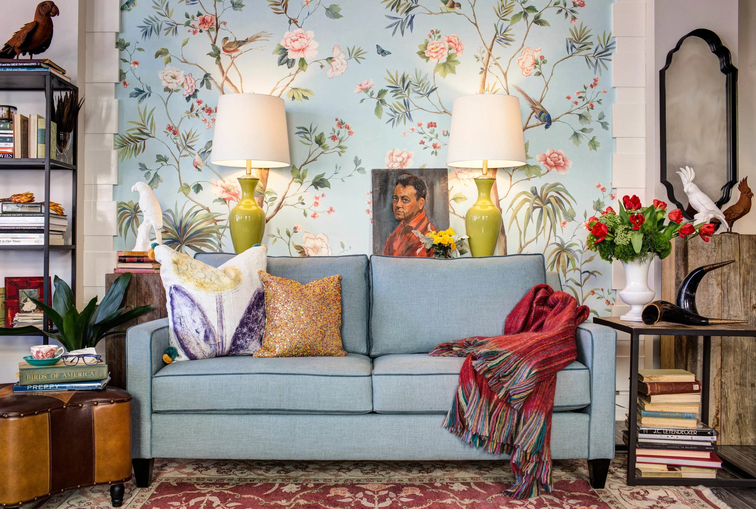
A Victorian Room
70s Matching Furniture
Embrace Multiple Styles and Influences
Create maximum visual interest by juxtaposing influences creates memorable impressions. The details of a carved antique are easier to appreciate when paired with sleek counterparts.
Offer The Sincerest Reflection of Your Lived Experiences
Family heirlooms provide meaningful stories to share, honoring the past while allowing for evolving tastes in the future. Eclecticism avoids the problem of investing entirely in one ‘look’ that might not please you down the road (see: the 70s furniture set, above).
Reinvent Your Inventory
New home, fresh context.
Be less rigid about what belongs where.
A china cabinet moves to the family room to become a grand curio for beloved collectibles.
Recover formal living room seating in vibrant, relaxed Sunbrella fabrics and put them in your sunroom.
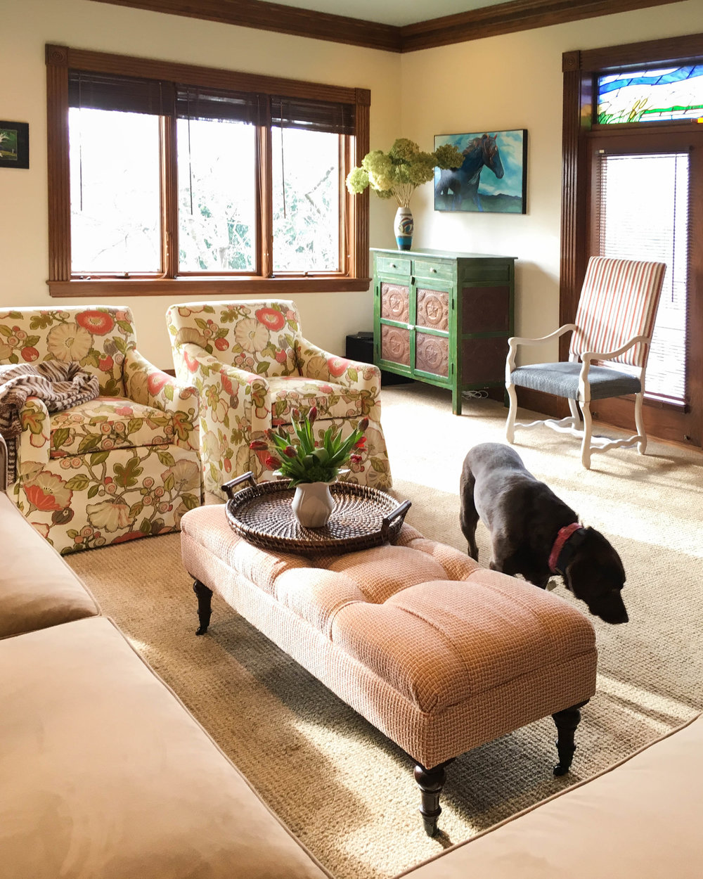
Photo Case Study: Here we placed a primitive pie safe in the corner of the family room, where it provides great storage. We picked up its green color in a floral performance fabric that helped further relax the style of the space.
Reinventing your inventory applies to art, too. Hang maps or technical drawings in the dining room - it’s sure to spark conversation with your dinner guests.
Connecting The Dots
Color is the great unifier.
Use wallpaper, subtle or bold, to freshen up your style.
Painting furniture can also change its interpretation and give one permission to use a piece in a different setting.
Photo Case Study A: Here, traditional chairs and a grand piano are paired with modern tables and a diverse collection of art. We used color to unify the space. Canyon Clay walls fulfilled our client’s love of color, while ecru fabrics created harmony between the upholstery, portieres, and rug.
Photo Case Study B: In this room we used a textured paper with a small geometric detail to honor the elegance of the homeowner’s collection, while introducing a touch of modernism.
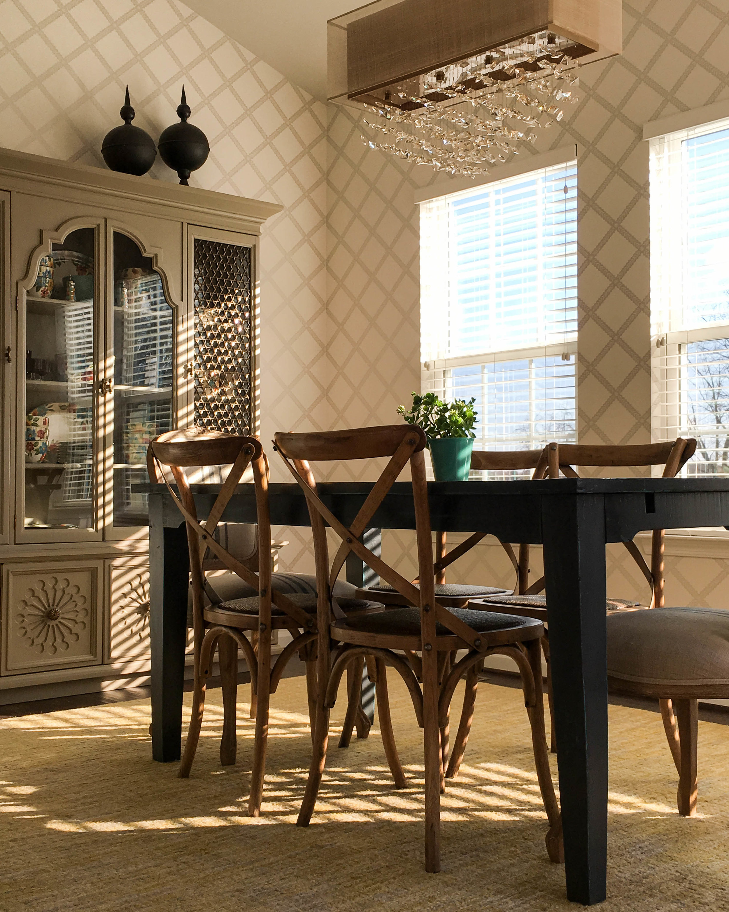
Photo Case Study C: In this kitchen eating nook, we painted an authentic mid-century china cabinet a relaxing shade of taupe and paired it with a primitive farm table and French bistro chairs. It works beautifully for storage and our client uses the upper portion for her everyday dishes, which freed up space in her kitchen for other storage needs.
Your Answered Questions
How do you evaluate whether to do a feature wall of wallpaper, or the whole room?
The architecture tells me when a feature wall is a good option. Generally in smaller rooms where there is something special on each wall, such as fireplaces and windows, I prefer to treat all the walls the same. Likewise, a wall with a lot of doorways is a poor choice for a feature wall. Contrasting a wall with paper or color is a great option for rooms that lack a strong focal point - and to draw focus to important furnishings such as beds and sofas.
What are some tactics that I can use for hanging art in an open floor plan?
In open floor plans, wall space is very often either vast or small, and finding that medium sized wall to easily scale art to is tricky. I recommend focusing on the large walls that have the most visual impact from numerous perspectives. You can use multiple pieces together for an emphatic gallery style installation. One of the most important resources you can have is a local framer with good taste - they can help pull together disparate pieces with similar framing and matting. I personally prefer shades of ivory, white, and dove grey for matting, depending on the tones in the art. Commit to a wider mat size to expand the impact of the art and to provide that coveted white space that helps isolate and dramatic the subject matter.
What do you suggest for art down a long hall corridor?
When possible in a long hallway, I think art should be placed where it is best viewed from the spaces that open off to left and right. Do not feel that the art needs to march along the whole length, evenly distributed along the way. It is more striking to create open space between strong statements, which can also punctuate and enhance the proportions of the hall.
How do you hang art in a space that has tall ceilings?
I do not let the ceiling height dictate the art height as much as the scale of the furniture and architectural proportions such as door and window headers. Generally I prefer to hang art a little lower that standing eye level. If art hangs too high above furniture, it has a cold effect, as though the art and furnishings are not trying to make friends.
How do you use mirrors in a space?
I am a big fan of mirrors. They magnify light, create an illusion of greater space, and reflect perspectives on the room not always perceived in real space. The beauty of mirrors is that, very much unlike art, the only thing you have to fall in love with is the frame. I use them in clusters, alone as statement pieces, and as filler in larger gallery wall installations.
What do you think about farmhouse style?
I try not to be mad at any trend because variety is the spice of life, although I would say take an eclectic approach to design. Then when trends or - most importantly - your tastes change, you are not stuck disliking most of your design. The other thing to consider is that by the time a style is really saturated, it is already past being the freshest idea - and there are a lot of inferior imitators. Try to find the most authentic and well-made versions of any trend.
Is it okay to mix color schemes as you go from room to room?
Flow is always important from one space to another. Sometimes it's tempting to think this means that the same two of three colors keep repeating from room to room, but this is not necessarily the only way to achieve flow. A few strong accessories, a couple of toss pillows, or a striking piece of art can be enough to reference color from an adjacent space. The thing about color is that it should always look like you know what you're doing, so that a room should never come completely out of left field with zero relationship to other spaces.
What about mixing pattern - how do you make it look like they go together?
Mixing patterns is really tricky and it happens best when it happens slowly and organically, adding a piece here and there in a design that evolves over months and even years. However, designers have to be able to establish striking mixes in real time, too, so we rely on some general principles to make the right choices. One rule of thumb is make sure there is marked difference in scale from one pattern to another. Also, geometric and linear designs look great next to organic, curving lines, which is why, despite some ups and downs in popularity, florals and checks are a long-established match made in heaven.
Where is reupholstery these days?
Because MakeNest is all about sustainable design, we are also big fans of reupholstering furniture. The better the quality of the furniture, the more sense it makes to recover it. Depending on the arm style and other construction details, the styling can often be changed by a talented upholsterer to update the look. There are few pleasures in design greater than seeing a piece of upholstery come back from the upholsterer with a whole new look. It is as fun as getting news clothes in your wardrobe.


