Paul Miller
Interior Designer
Whether you’re an accomplished cook or catch your meals on the fly, a kitchen that functions smoothly and pleases the senses is probably at the top of your design wish list. There are some tried and true guidelines that most people are familiar with today, such as the triangle configuration of sink, stove, and refrigerator. If you want to design your kitchen for maximum visual impact without sacrificing functionality, here are a few tips from our portfolio of designs.
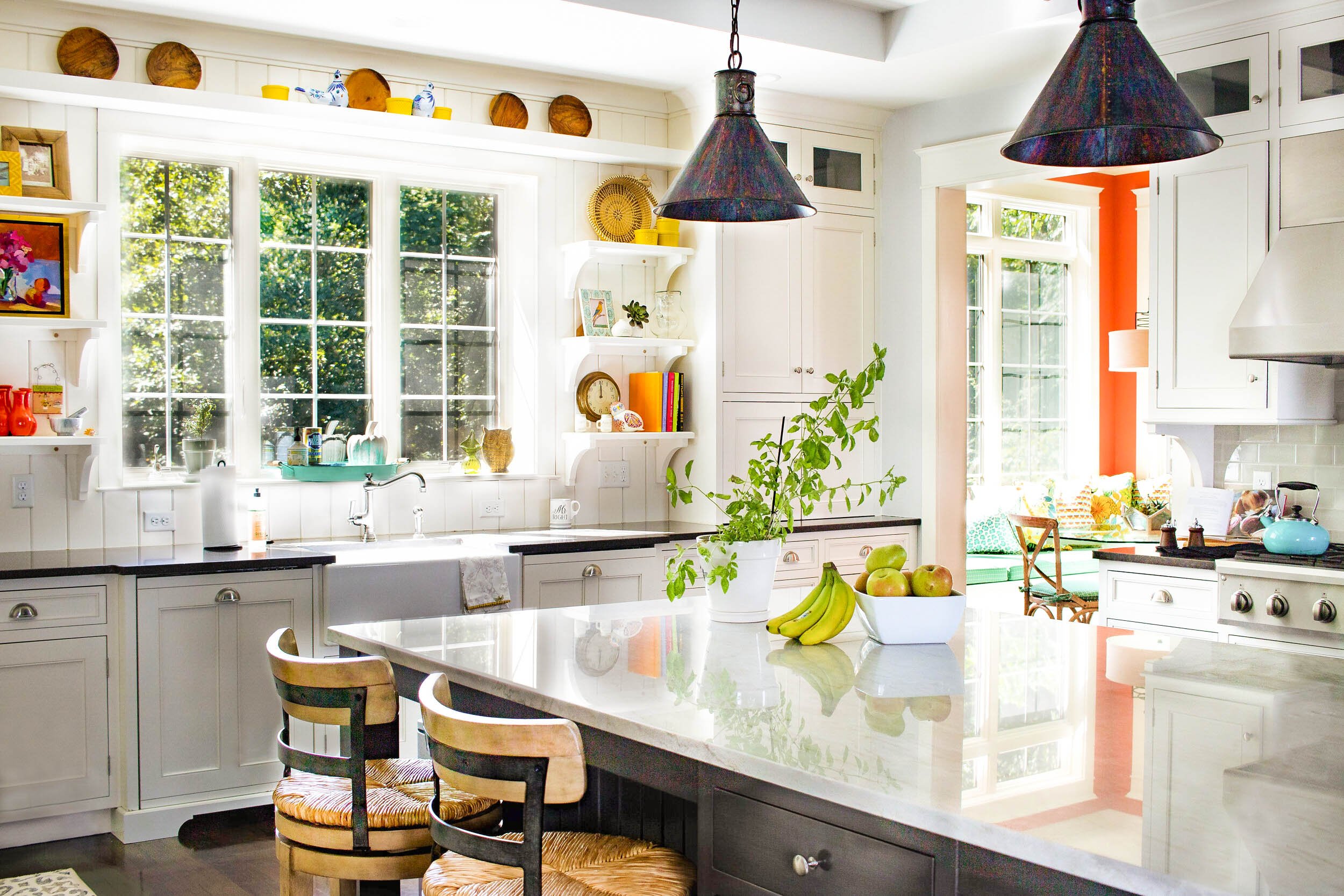
Let The Sun Shine In
Generous natural light not only makes for better daytime task lighting, it is written into our DNA on some level to equate a sunny kitchen with comfort, joy, and welcome. When the space allows it, opt for as many large windows as possible. With more windows comes less upper cabinet storage, so it’s important to plan thoughtfully. In this kitchen from our Nest #335 project, we took advantage of the beautiful custom open shelves to add personality and interest to this gorgeous architectural focal point.
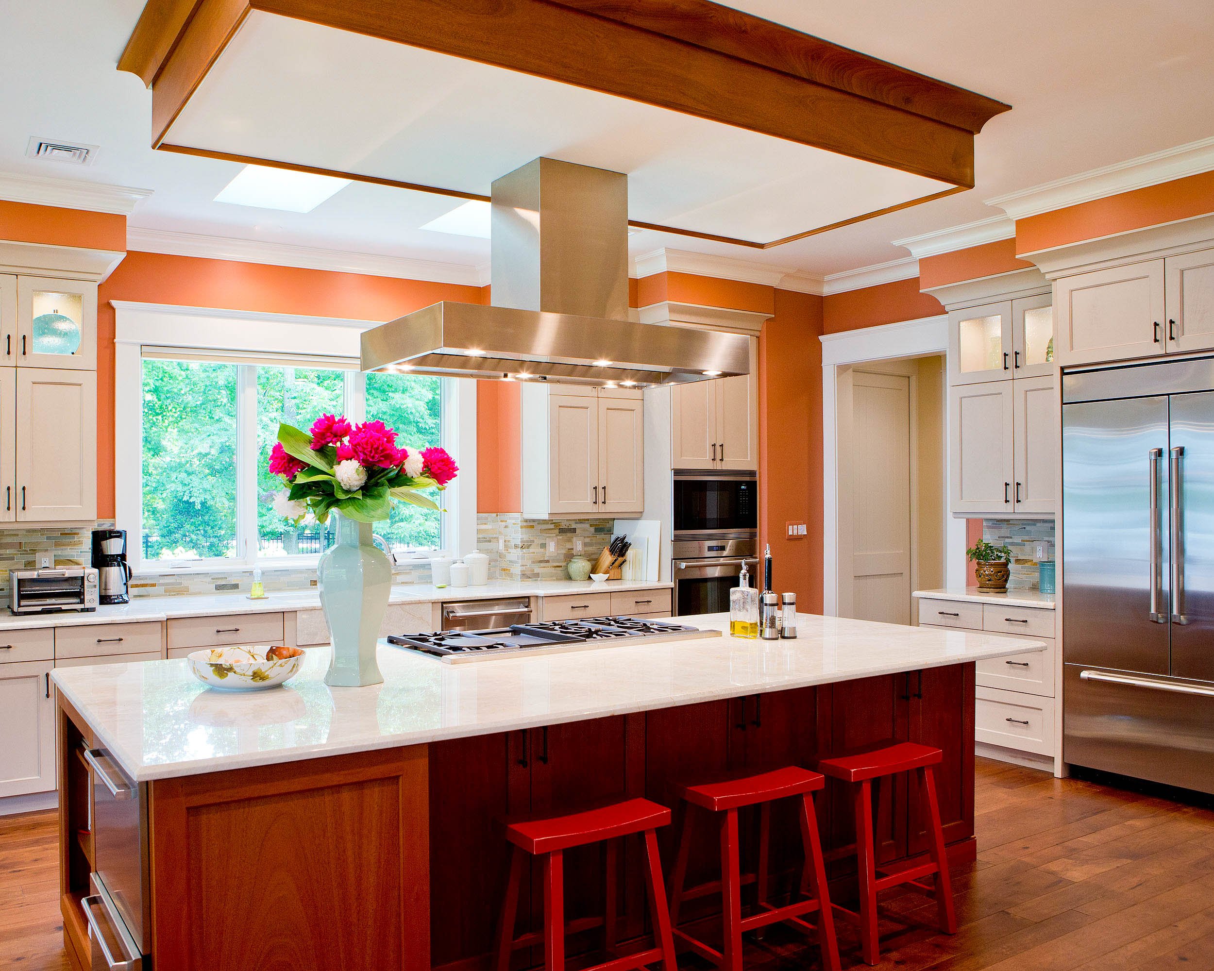
Use Happy Colors
In our Mason's Neck project, I selected a confident russet hue to provide a warm contrast to the soft mushroom cabinet finish. Whether using a warm tone or a cool one, color can inspire creativity. In general, finishing cabinetry in neutrals such as greige or white - or in a pleasing wood finish, for that matter - will ensure classic style that withstands trends, so consider using a statement wall color for impact that can be reinterpreted easily over time.
Take It To The Top
In our Stewart Cottage project, I wanted to add drama to keep the eye moving upward, so I designed for the backsplash tile to continue past the base of the upper cabinets. With only few exceptions, the proportions of a kitchen are enhanced by tactics that make the ceiling appear higher. By taking the tile all the way up, the overall space appears larger and more tailored.
Photo: Matthew Lofton
Consider Your Focal Point
In our Handley Boulevard project, I knew that the largest wall of the kitchen would be a focal point from the adjacent family room. It was important that the cabinetry provide furniture-like beauty to prevent this sight line from feeling heavy. Glass fronts and a mullion design with a sweeping curve were just the right touches to achieve the desired effect. The floors, striped in alternating hardwoods, point the eye toward the kitchen focal point, as well.
Photo: MakeNest Interiors
Great kitchens require research and detailed planning. With impactful choices that compliment the proportions of the space and a well-reasoned layout for successful workflow, the kitchen becomes a well-loved center of activity where family and friends can get together to create meals and memories for years to come.
If you are interested in our design services, please tell us about your project!


