< Projects

Photo: Matthew Lofton
About This Design
Interior Design: Paul Miller
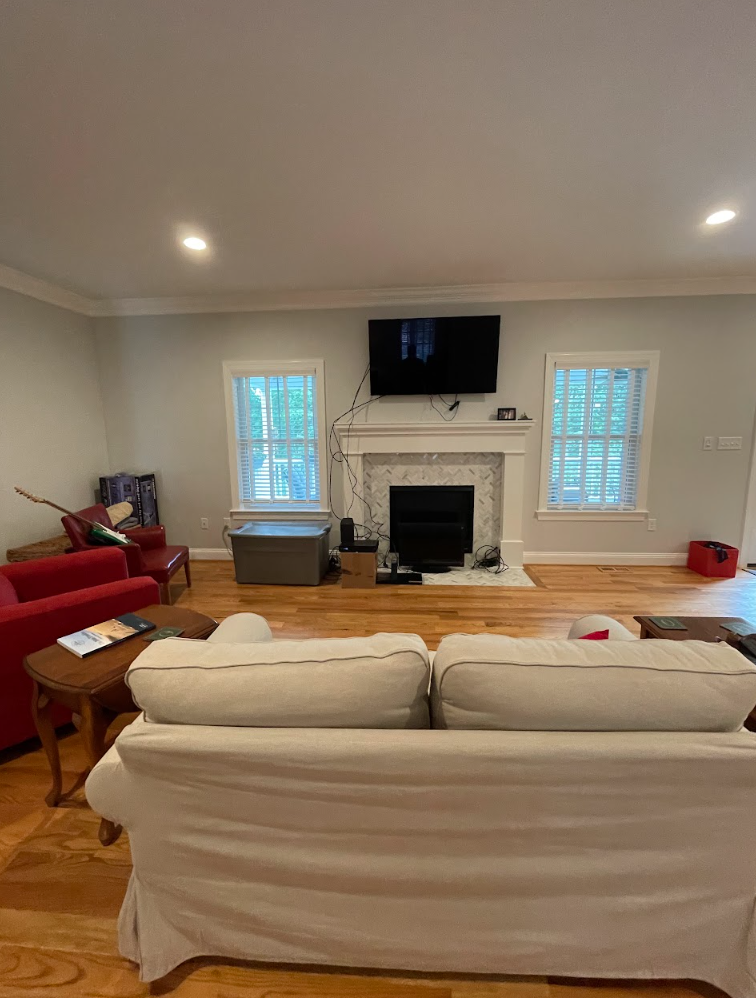
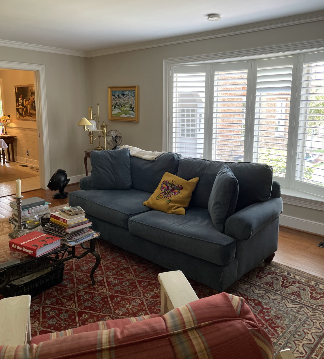
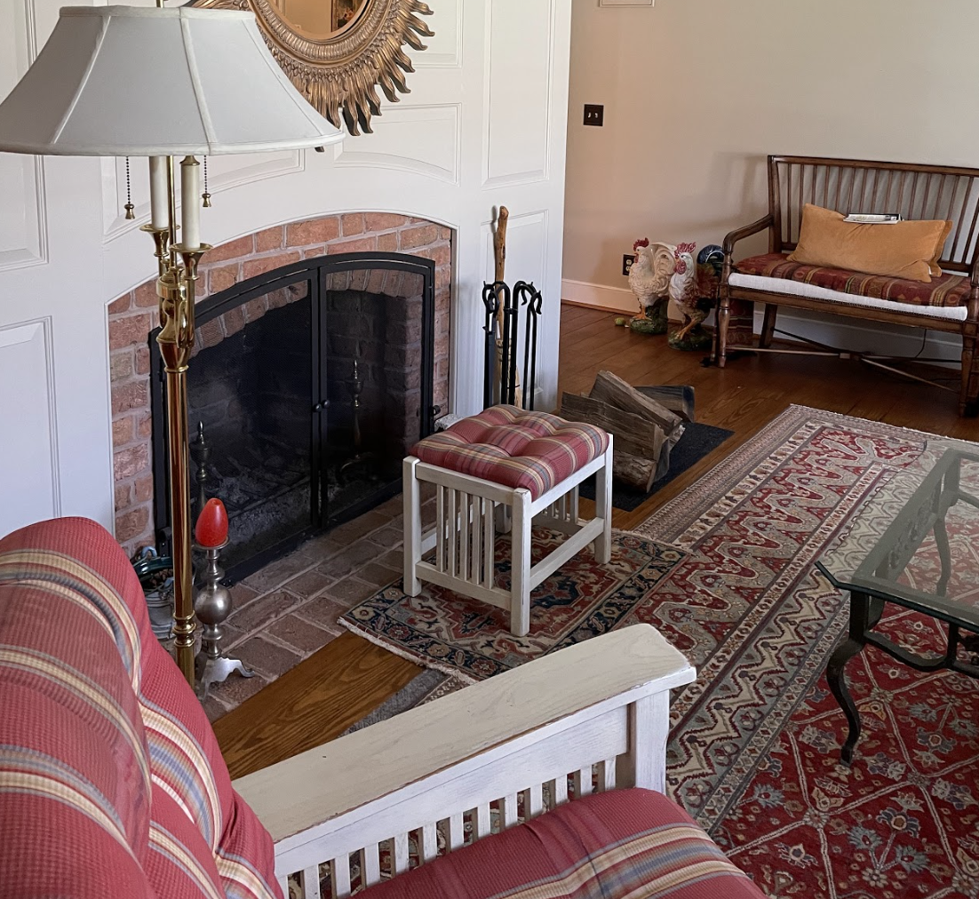
“There’s just too much white!” Our client threw up her hands in disgust, explaining the issue that was keeping her from feeling satisfied with her new home.
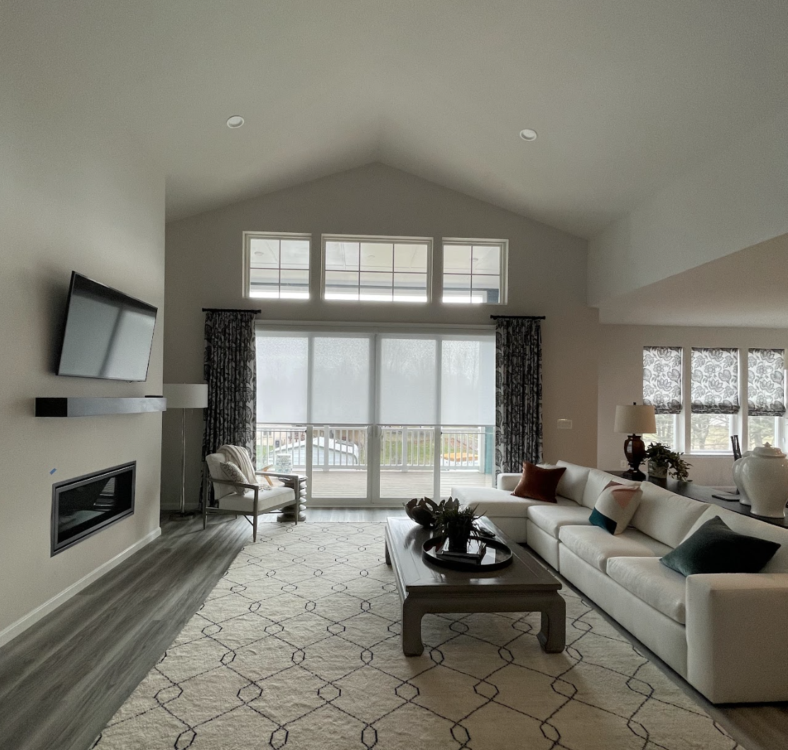
She was right. The open concept kitchen, dining, and living area was swimming in bland sameness. Tile, walls, countertops and cabinets - all in white.
During my study of the area, I quickly deduced that the rooms needed more contrast and texture. They also needed some simple architectural choices to help define the areas and add warmth. The way that the dining area pushed back farther seemed to invite a choice that would exaggerate that depth. I also knew that for this area to distinguish itself as not merely a glorified breakfast nook, it would need some theatrical glamour.
There were some other factors to take into account.
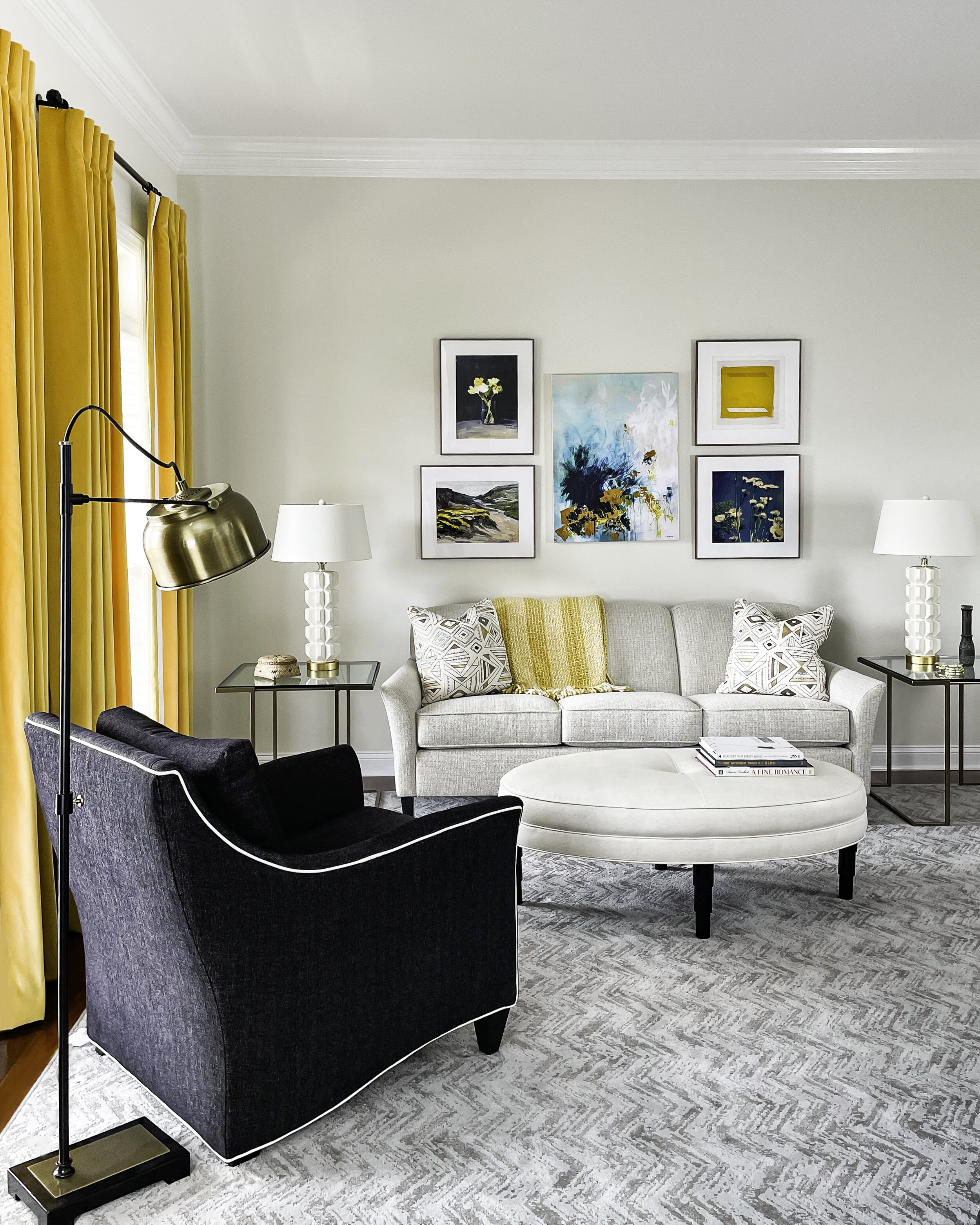
My client had already invested in her drapery and, always conscious of making wise and sustainable choices, that meant I would be factoring in the contemporary black and white botanical as I developed the color palette. This was a challenge, given how much I believe that color elevates the mood of a home, but ultimately I found that adding tones of red and pink would play well with the existing, high contrast components.

Photo: Matthew Lofton
To create the desired visual separation between the areas, I designed and had made four stout, maple columns, installed without trim for a modern, no-frills aesthetic in keeping with the house. A toasty brown finish was selected, allowing the grain of the wood to show and introducing a warmer tone.
On the drapery, we changed out the hardware, bringing in aged brass and extending the rodding over the long expanses of the back windows and doors, drawing a line that grounds the room beneath the raised portion of ceiling in the family room.
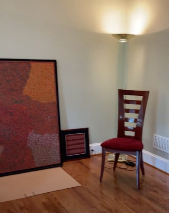
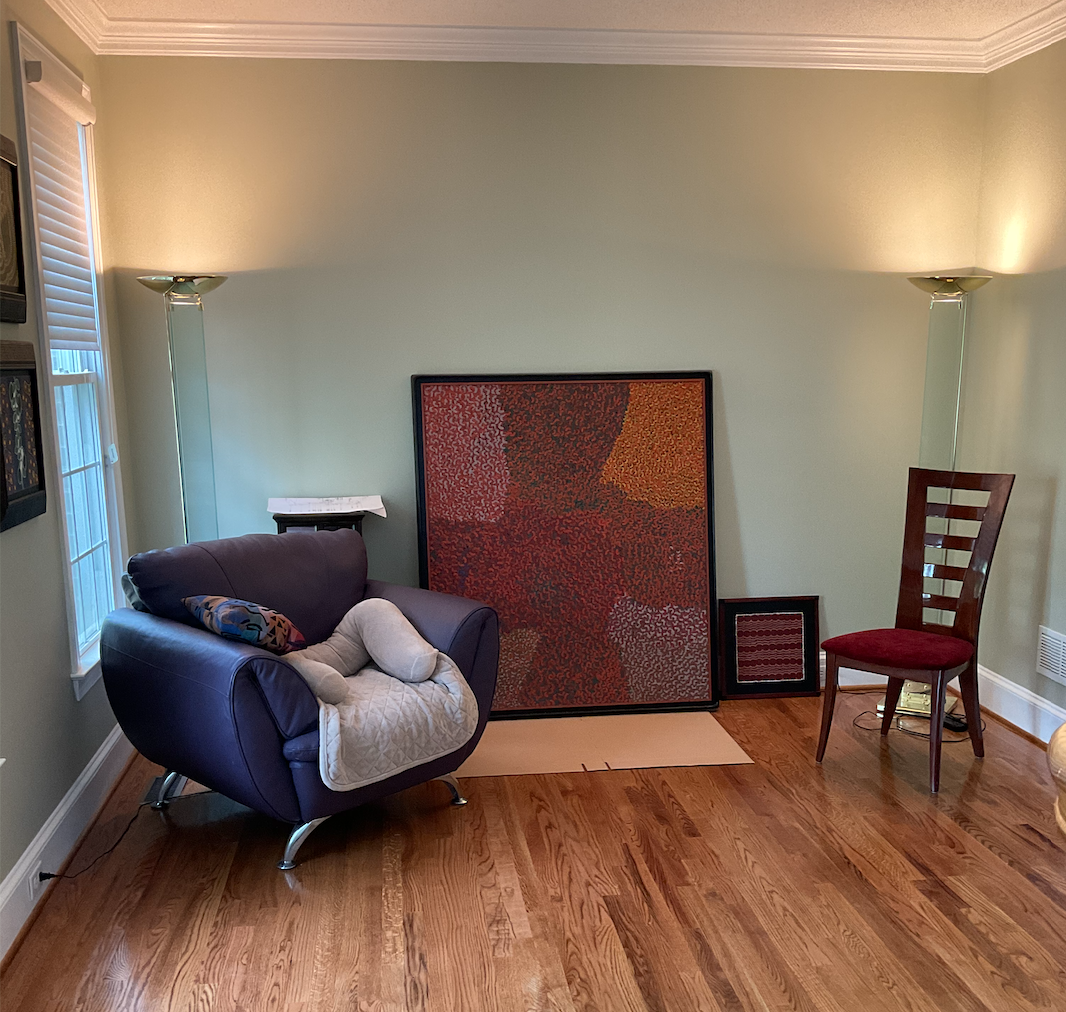
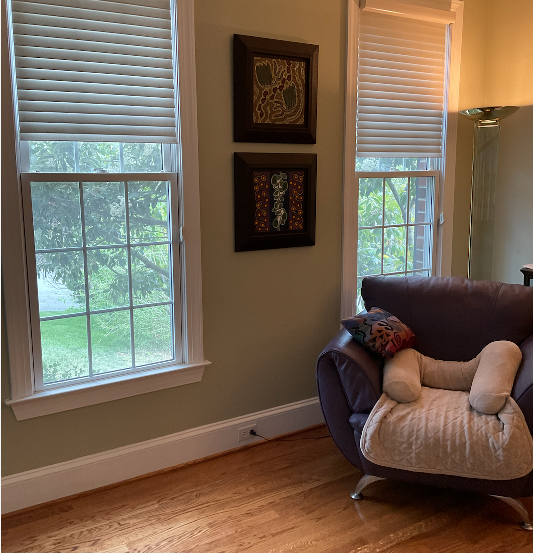
A pair of chairs with Art Deco influences, relegated to the basement, were reimagined with a soft rose-toned fabric inspired by a pair of dreamy floral wall hangings harvested from the foyer. A chair already present in the room was given new life with a textural woven in shades of pumas, red, and orange, which reads as a mellow Nantucket red from a distance.

Photo: Matthew Lofton
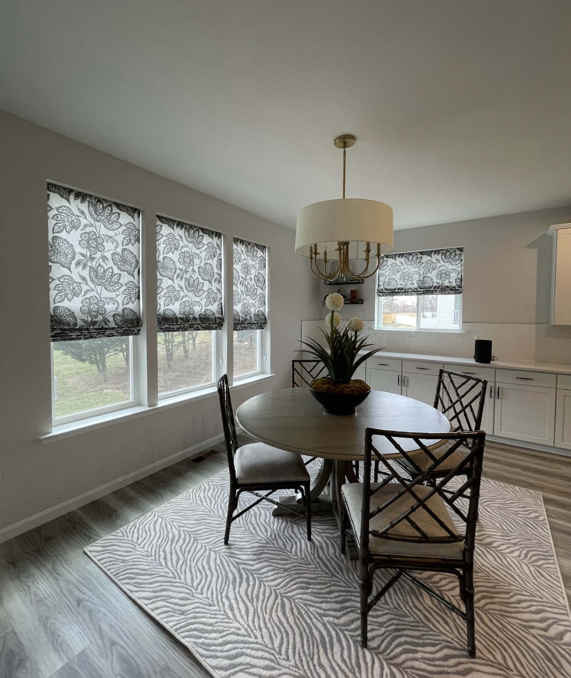
In the dining room, I had floating shelves made from the same maple as the columns and we added a wallpaper with charcoal and metallic gold lines on a black field. This paper pushes these walls outward visually, making the room both cozier and larger-feeling. Again, I wanted to drive the far wall of the dining area back in order to amplify the added depth this part of the floor plan already offers.

Photo: Matthew Lofton
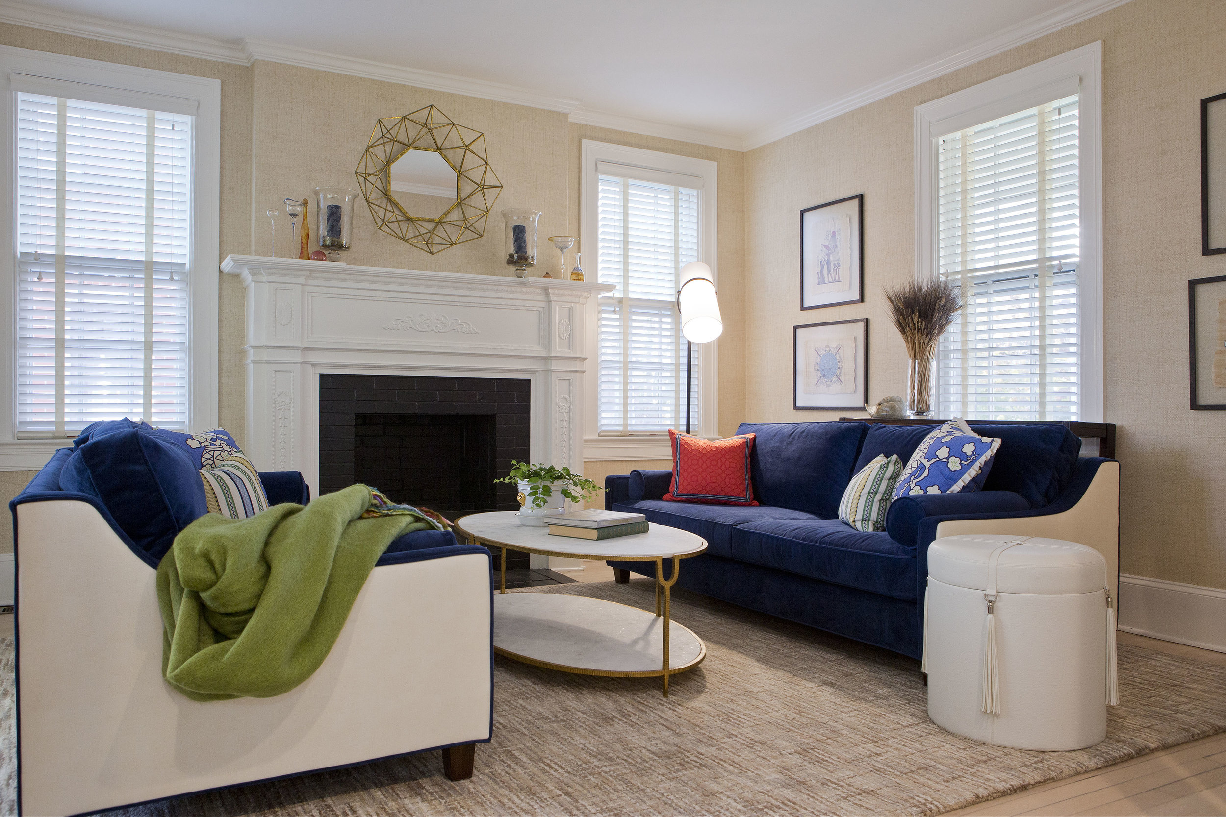
Drapery in a subtle, dove-grey textile adds luxurious folds without competing with the black and white botanical on the existing Roman shades. A striated wool rug in rich, inviting red adds life to the space and beckons one to come in and relax. Detailing the room with accents in brass, black and white pottery, and inlaid wood heightens the glamour. Bright greenery keeps the tone of the space fresh.

Photo: Matthew Lofton

Photo: Matthew Lofton
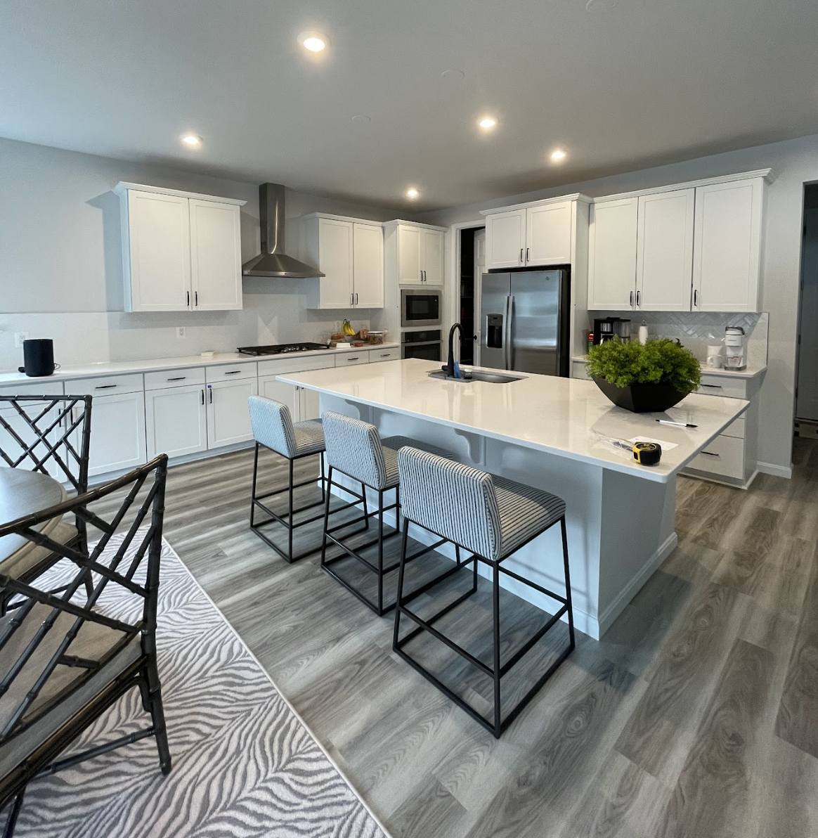
The kitchen island was painted in Benjamin Moore’s CC-548 Asphalt in a satin finish, shattering the monotony of the white cabinets. Hardware in black was replaced with pulls in aged brass.
Paint again pierced the dreaded uniformity, this time in the family room, where we had the fireplace mass and mantel shelf painted in Benjamin Moore’s 1603 Graphite in matte and semigloss respectively. These choices add contrast to the room, while providing points of weight for balance and rhythm.
In a thoughtful design, every choice is strategic, even surgical. In this project, a few strong choices dramatically altered the appearance of these rooms and sent the white sterility away like a thick fog pushed off by a breath of fresh air.