< Projects
About This Design
Interior Design: Triana Griffith | Paul Miller
Our clients wanted to transform their old-fashioned 1960s basement into a cozy, welcoming place for TV watching, bourbon sampling, and just getting away. The space needed cosmetic improvements like new flooring and ceiling treatments and improved architectural details, such as hiding away retrofitted ductwork.
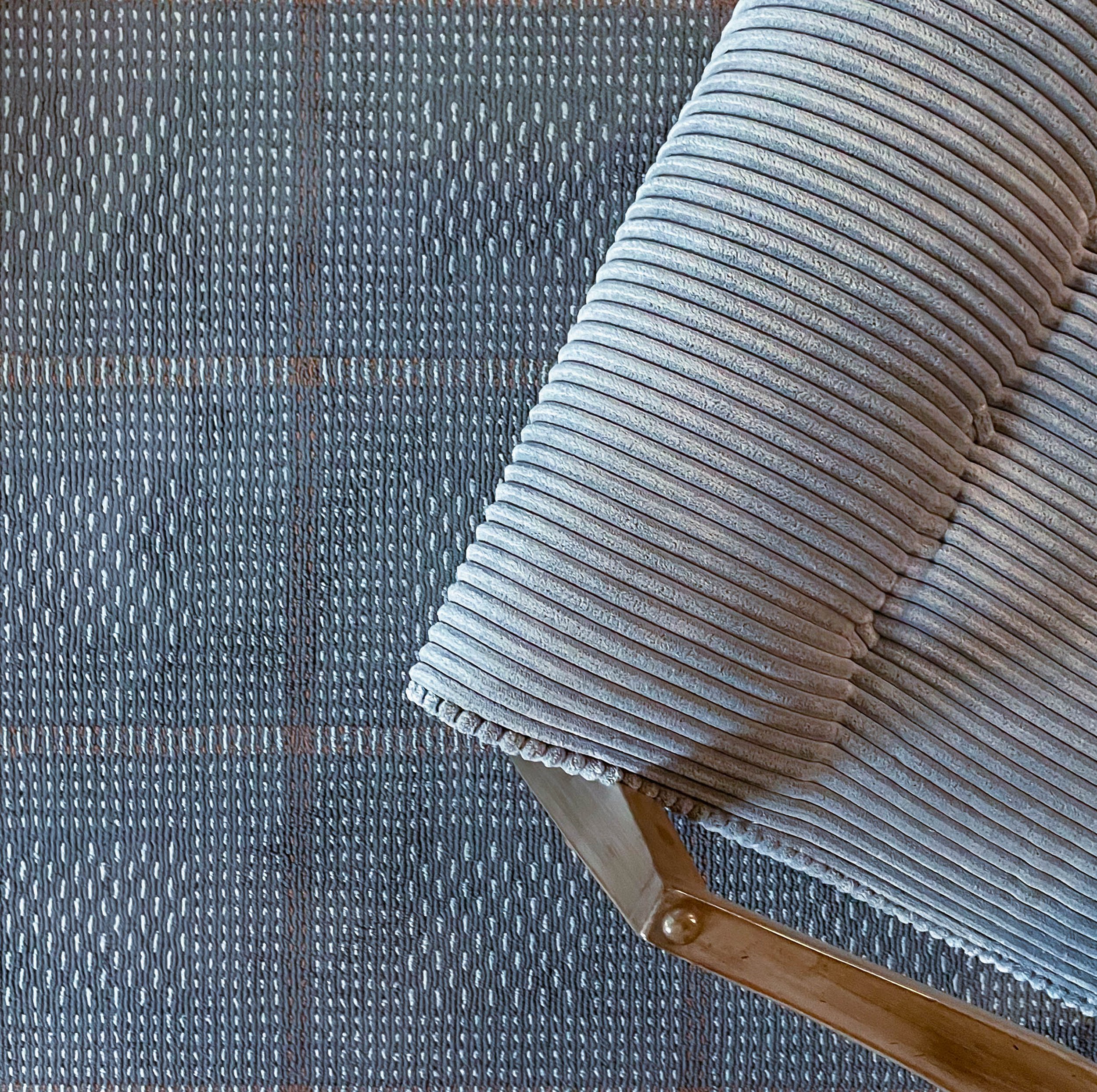
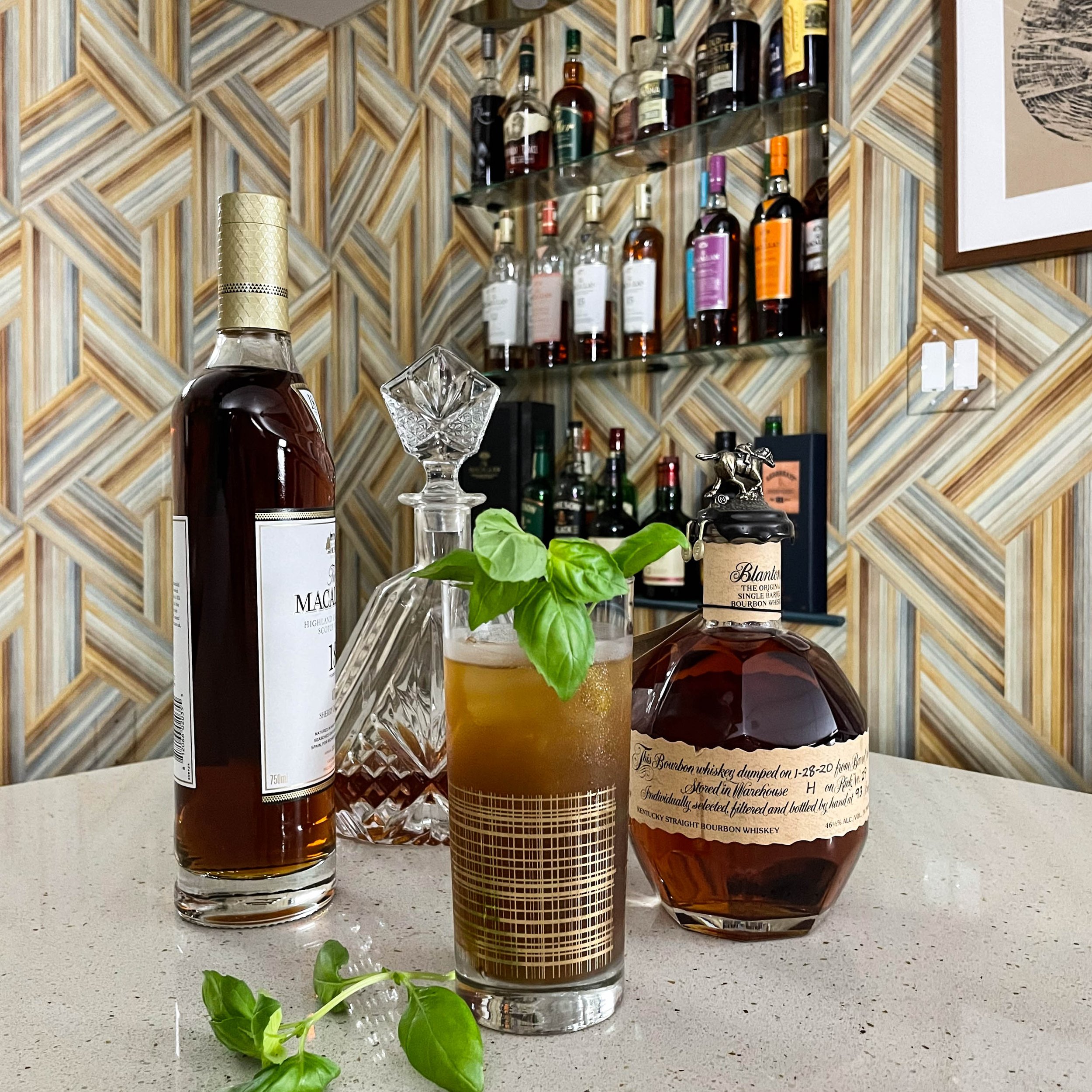
Despite initial debate about keeping the original bar, the ultimate decision to replace all of the cabinetry in this space meant that our clients would enjoy more efficient storage and attractive finishes, as well as better craftsmanship. As the bar was central to the overall design, we selected a dramatic geometric wallpaper in a wash of beautiful colors that inspired the fabrics in the seating area. The plaid carpet and stylish corduroy accent chair are hip callouts to the home’s midcentury origins. A mix of caramel tones in leather and textiles further the striking contrast of warm and cool notes in the color palette.
The new brass wall sconces reference the diagonal lines in the wallpaper and offer origami-like artistry to the design. We carried the original planking all the way up on the wall surrounding the bar so that our selection of Benjamin Moore’s rich, relaxing New Providence Navy would frame the wallpaper strikingly. A lighted niche behind the bar offers display and ease of access to our client’s evolving collection of whiskeys.
This project was a great exercise in working within the dimensions of a space but completely changing the perception of it through deep colors, thoughtful patterns, and fearless choices. It’s important to make rooms in our homes that take us away and have unique character. As neat as it was to see this space transformed, learning that our clients look forward to retreating nightly to what had been a gloomy, seldom-used area of the house is exactly what we wanted for them. Cheers to change!


